Classifying Heart Disease Risk in America
What is the risk of heart disease across the United States? Are there riskier locations in the USA that have higher chances of heart disease than others?
My group chose to work with the heart disease data set from the UC Ivine Machine Learning Repository. This particular data set is popular choice among machine learning courses, and it remains as one of the most detailed patient-level data sets for heart disease that’s publicly available. As a part of an insurance company (“Mcnulty and Associates” was the company name our group gave ourselves), I would be interested in identifying high/low risk populations that our company could charge different insurance rates for.
A substantial amount of work for this project went into cleaning the data and reshaping it into the format I needed. As a group our first task was to insert the data into the MySQL database server. The data contained corrupted entries that needed to be scrubbed before insertion. Once the database was properly set up so team members could query it, I collected 2013 data from the BRFSS prevalence and trends. It contained state-level population statistics such as the proportion of people who are smokers, who have high cholesterol, who have a family history of heart disease, who are diabetic, and so on. I originally wanted to include family history and years spent smoking, but I was having difficulty getting my classifier model to have sensible results. My final list of features were:
- age
- gender
- smoking
- daily smoker
- diabetes
- high cholesterol
I had hoped for more, but obtaining recent health data that matched the UC Irvine data set I trained on was difficult. The BRFSS data also converted ages into categorical bins that individuals were placed in, so I had to transform the original data set to match this scheme.
How well does the model fit?
| precision | recall | f1-score | |
|---|---|---|---|
| SVM | 0.72 | 0.82 | 0.77 |
| Decision Tree | 0.73 | 0.80 | 0.77 |
| Logistic Regression | 0.73 | 0.80 | 0.77 |
Nearly all of the algorithms performed similarly. There was still the option of trying an ensemble method like random forests to boost the precision/recall, but I was interested in looking at thefeature values from logistic regression to gain some insight into what the model was doing:
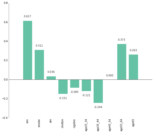
A positive value for a feature means it is associated with heart disease, and a higher value means that association is stronger. Unsurprisingly, the model is showing that older people have a higher chance of having heart disease. Smoking and diaebetes are also associated, but surprisingly having high cholesterol (cholbin) and smoking every day (cigsbin) is negatively associated with heart disease. This is likely the result of particularities in the training data set where only individuals marked as positive for high cholesterol and smoking every day just happened to not have heart disease. The overwhelming association of males with heart disease (sex=1) is also a result of the skewed training set:
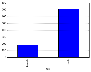
With an overwhelming male majority, simply being male puts you at a much higher probability of having heart disease.
Ultimately, I wanted to see what this model had to say about the current population. I used this model to predict the probability of the “average” person in each state to develop heart disease and ranked them based on Z-score:
So there it is: DC is officially the least likely “state” to get heart disease, and Montana is the most likely.
Needless to say, there’s a lot of problems with the methodology I used to get this result. The z-score chart is inherently deceptive: the difference between the top (DC, 63.71%) and bottom (Montana, 65.17%) states only comes out to be ~1.46%! There’s also the issue this data set is from 1988. In the 25+ years since this data was collected people’s heart health and living habits have certainly changed, so 25 year old data isn’t the most relevant training set for a model to be used on current health data. However, I think this served as an interesting example of classification prediction and using D3 to visualize results.